

Most web designers know how important mobile-friendly sites are. They know that the best-practice for mobile sites are responsively designed. The challenge comes in knowing for which dimensions you need to design a site.
Thankfully the data is in your Google Analytics account. In this article I’m going to show you how to get at this information. I’ll also show you how to pick the breakpoints to account for most of your users.
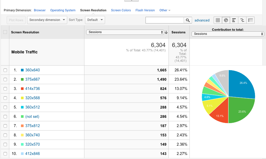
What are the screen dimensions for your mobile users?
You can get this information from Google Analytics. Go to
- Audience > Technology > Browser & OS.
- Next, beneath the graph, click “Screen Resolution.”
Now you can see the many different dimensions from which users view your site.
If you don’t have many visitors, extend your date range until you have more examples from which you can draw.
If you want to keep this simple, you could test your website with the ten most popular resolutions. Heck, click the pie chart and you might find that that 10 most popular resolutions account for 75% of your traffic. You could also use Segments to see screen dimensions for mobile and tablet devices as well.
For a more scientific approach to choosing mobile breakpoints, let’s use statistics. Here’s how I calculated my breakpoints with a little help from Excel.
Gather the Mobile Screen Resolution Data
- Starting with Mobile Devices, I changed my Google Analytics segment to only look at Mobile Traffic.
- From Audience > Technology > Browser & OS and “Screen Resolution” in Google Analytics I selected a time frame to give me enough data. Next I show all rows of screen resolutions.
- I export this data into an Excel sheet, from which I’ll do my analysis.
- Finally, we need to clean-up some of this data. I removed the (not set) row. When I’ve done this for other websites, I’ve seen 1×1 or even 0x0 resolutions- and removed those as well. They are clearly not real devices- and I don’t want these to throw-off my numbers. Remove those from your data set, as well.
Finding the Average Screen Width
- To find our breakpoints, we just want to know the widths of screens. We’ll need to parse the dimensions and only retrieve the width. Insert a column after the screen resolutions (I’ll assume that’s column A). Parse the resolutions to only get the widths with the formula:
=VALUE(LEFT(A2,FIND(“x”,A2)-1))
Copy this down to the bottom of your rows. This will give us the width off each resolution (as a number).
- We don’t want just the average of all these widths. Some of these widths were only seen once, in our time frame. That’s not worth as much consideration as screen resolutions that occurred more often. Insert another column after the number of sessions (I’ll assume this is after column C, at this point). To get at this, we need to multiply the screen resolution (column B) by the number of sessions (column C) that each width received. Copy that down to the bottom of your cells.
- Let’s find the true average- that considers how many times a width occurred. Take the sum of the multiplied numbers cells (column D) and divide it by the total number of sessions for that time period (the last item in column C). This is your true average. Add this formula in the last cell of column D.
Finding the Most Common Screen Resolutions
The average width isn’t our breakpoint. We need a width that includes the average plus a little bit to account for other common dimensions. Where do we cut-it off? How can we make sure we set a breakpoint that account for the most common widths? We could guess or we could use statistics. We need to calculate the standard deviation. This will make sure we build our site for the most commmon resolutions and not worry about the rarest cases.
For this we need to make a couple extra calculations.
- Insert a new column after the one you just created (I’ll assume this is column E). Take the difference between a screen width (column B) and the average screen width (the bottom of column D). This is how much different each screen is from the average. Next we need to square this number (why). Since we want to weigh this with how many times a screen width was used, we multiply this number by the number of sessions (column C). For example: if cell B2 contains the width for that row, D92 contains the average (we calculated previously and C2 contains the number of sessions, we’d use this formula:
=((B2-$D$92)^2)*C2
Copy this down through all rows. Notice: I’ve put a $ before D and 92, because that cell doesn’t change, as you copy these down to each row.
- If you were to now add all those numbers (rows 2 through 91 in this example) and divide by the total number of sessions (C92), you’d get your variance. This represents how many different resolutions occurred. It’s not useful to us except to use it to calculate…
- The standard deviation. This tells us how far above (and below) a width might be and still be normal. Anything more than the average screen width plus the standard deviation is larger than normal. Anything less than the average screen width and the standard deviation is smaller than normal. You calculate the standard deviation by taking the square root of the variance.
When I ran this calculation on one client I found the average mobile screen width was 372 pixels. Anything smaller than 200 pixels wide wasn’t worth worying about. Anything more than 543 pixels was wider-than-normal for a mobile device. That means my max-width for mobile should be 543.
What about Breakpoints for Tablets?
I can run this for tablets, to find my tablet breakpoints. Instead of using a Mobile Traffic segment, I’d run the same process with the Tablet Traffic segment. This tells me my average tablet screen width is 790 pixels. The smallest tablet has a width of 560 pixels. The largest tablet has a width of 1020 pixels. So, for a responsive design, my max-width for tablets should be 1020 pixels.
Not Every Site Should Have the Same Mobile Breakpoints
The data, above, was for a law firm’s website. When I ran the data on an online education portal, my numbers were different. The average mobile width was 391 and ranged between 225 to 557. That’s a little bigger than the law firm’s mobile devices. The same trend continued with tablets. The average width was 873 pixels and ranged between 480 and 1,266. This might be because the online education site was technical in nature. It’s audience might have more up-to-date (hence larger) phones.
This brings up an important point: not every website needs the same dimensions. Each client might be a little different. Running the data on this could help improve their user experience, making your already loyal visitors even happier.
In fact, as technologies change, you might return to this report (every once in a while) and update your breakpoints with new technologies.
What does your data tell you? Is your data similar or completely different? Did I make an error in my calculation? Leave your thoughts in the comments, below.